Branding one of the creative team’s favorite kinds of projects. Trying to find the essence of what a company is in one little mark, but making it strong enough to lead the look and feel of an entire company is challenging yet exciting. We wanted to share a few of our favorite designs from this past year and allow a peek into our creative process.
OZARK GREENWAYS REBRAND

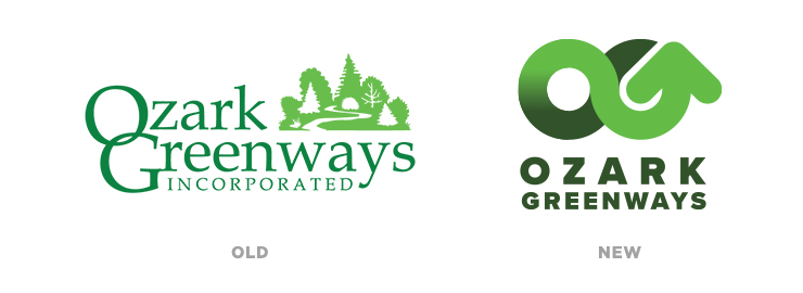
Ozark Greenways is a Springfield, MO non-profit, dedicated to building and growing our system of trails and parks to connect our communities. After completing our brand development workshop, the board of directors determined that a new logo could better demonstrate their mission and values. Through the brand development process, Ozark Greenways changed their communication focus from conservation to moving the community forward through trails. This newfound clarity made our goals clear, providing Ozark Greenways with a mark that could drive them forward as they strive to expand the trail system in and around the city. After presenting multiple directions and having great conversations with the client, there was an obvious choice for a new direction.

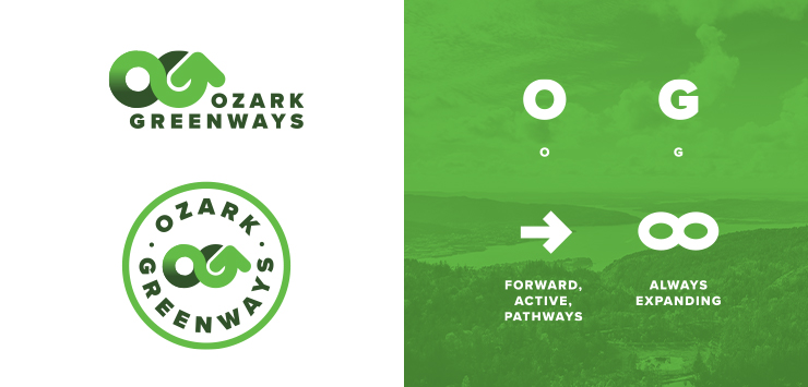
“Active”, “forward”, “pathways”, and “always expanding” were all words that were used when discussing our direction. The design was driven by Ozark Greenways’ commitment to moving forward, in both the literal and figurative sense. This one has easily become one of our favorite logos.
SULLIVAN BANK REFRESH

Sullivan Bank (formerly Bank of Sullivan) is a regional bank based out of Sullivan, Missouri. With 125 years of tradition in banking, we were given the task of refreshing their brand to better reflect their growing footprint and commitment to digital solutions. After going through our name development process, it was decided that a minimal transition in the brand was the direction to head. This change led to the desire to refresh their logo design for their updated name. The goal was to modernize the design of the logo while keeping the equity and heritage of the mark their customers have come to trust. We wanted to make sure when customers saw the new logo, there was still no doubt Sullivan Bank was still the same bank it had always been.

Updating branding without letting the design limit the new design can be challenging. Our process for the update was driven by a “scale” of concepts, ranging from very minimal updates, to more drastic (but still evolutionary) changes. This allowed us to give the client options that would feel comfortable, but also allow them to see how the equity of the old logo could still be kept with the more updated concepts. Ultimately, we landed right in the middle of the scale. Refreshed and modernized, but with almost every previous element reimagined. To lead the design of collateral and their new website we developed a set of patterns and angles, clearly tying all their new elements back to the updated logo design.
Be sure to follow our instagram for sneak peaks and breakdowns of more logos down the road. If you’re searching for branding services, get in touch with Revel today.
